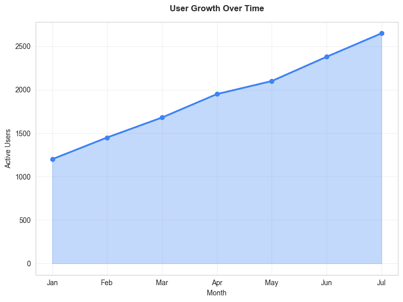
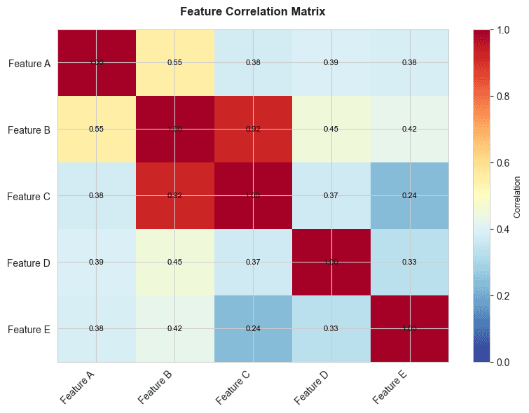
Stop wrestling
with Excel.
Start impressing.

Create beautiful charts in minutes, not hours.
No Excel or coding expertise required.

Free to try. No credit card required.

Bar chart
Line chart
Pie chart
Scatter plot
Area chart
Heatmap

How it works

Create stunning charts in just 4 simple steps. Upload, clean data, customize, and export in minutes.

Upload Data

Step 1 of 4
Private - Data stays in browser
Upload File
Google Sheets

Drag & drop file here

or click to browse

.csv.xlsx

Turn your data into stories worth sharing

From simple bar charts to complex visualizations, CleanChart empowers you to turn any data into beautiful, interactive visuals that wow your audience.

Line Chart

Trend Analysis

Professional and beautiful down to the last detail

Every element of your visualization is carefully optimized for the best possible display – from layout and typography, all the way to legends, axes, and tooltips.

Bar Chart

Comparisons

Pie Chart

Distributions

Area Chart

Volume Over Time

Scatter Plot

Correlations

Heatmap

Density Maps

Histogram

Frequency

Grouped Bar

Multi-Series

Stacked Bar

Part-to-Whole

Box Plot

Statistical

Bubble Chart

3D Data

Violin Plot

Distribution Shape

Legible and accessible by default

Labels that don't overlap. Colors that are accessible by default – CleanChart makes it easy to create visualizations everyone can understand.

12 chart types available

Publish your visualizations anywhere

Export your charts on any platform, in any format.
From mobile apps to presentations, printed reports, and more.

9:41
CleanChart

Q4 Revenue Analysis

Mobile chart preview
Mobile
Presentation.pptx
File
HomeInsertDesign

Q4 Revenue Analysis

PowerPoint chart preview
PowerPoint
CLEANCHART REPORT
Page 1

Q4 Revenue Analysis

Generated on Jan 8, 2025

Print chart preview
cleanchart.comConfidential
Print
.png.svg
The Old Way
chart_generator.py
1import matplotlib.pyplot as plt
2import pandas as pd
3df = pd.read_csv('data.csv')
4fig, ax = plt.subplots(figsize=(10, 6))
5ax.bar(df['category'], df['values'])
sales_report.xlsx
11. Select data range A1:D12
22. Insert → Charts → Recommended Charts
33. Select chart type, click OK
44. Chart Tools → Design → Chart Styles
55. Format Axis → Number → Custom Format
66. Right-click legend → Format Legend...
The CleanChart Way

Drop your CSV or Excel file here

or click to browse

.csv.xlsx
The CleanChart Way
My Sales Chart
Saved
Beautiful chart
Created in 30 secondsZero code written

No-code creation, stunning results

Create professional-grade visuals in minutes — no coding, no hassle. Simply import your data and transform it into visuals that grab attention. It's as easy as it gets.

No coding required

Forget Python, JavaScript, or any programming language

No Excel chart wizards

Skip the endless menus, formatting options, and chart tool ribbons

Auto-clean & instant results

Upload messy data, we clean it automatically, and you get a beautiful chart in seconds

Create better charts in less time

From messy data to beautiful visualizations in seconds.
CleanChart handles the hard work so you can focus on insights.

1

Upload Your Data

CSV and Excel supported

Drop your CSV or Excel file and watch it get recognized instantly. No configuration needed.

Drag & drop simplicity

No complicated import wizards. Just drag your file and you're ready to go.

2

Auto-Clean Your Data

Smart data cleaning

Automatically detect and fix missing values, duplicates, and formatting issues. No manual cleanup needed.

Instant data preview

See your cleaned data immediately with a clear preview. Full transparency, no surprises.

3

Create Beautiful Charts Instantly

One-click chart generation

Select your data, pick a chart type, and get a professional visualization instantly. No design skills required.

AI-powered recommendations

Not sure which chart works best? Our AI analyzes your data and suggests the perfect visualization.

4

Export Anywhere

Multiple export formats

Download as PNG or SVG. Perfect for presentations, reports, or social media.

High-quality downloads

Get crisp, professional-quality charts ready to use in any document or presentation.

Pricing

Simple, Transparent Pricing

No subscriptions. No hidden fees. Just tokens for charts.

Starter

Perfect for occasional charts

$9

$7

USD

  • 10 chart tokens
  • All chart types
  • Data cleaning included
  • High-quality PNG export

Pay once. Tokens never expire.

POPULAR

Pro

Best for regular users

$19

$15

USD

  • 25 chart tokens
  • All chart types
  • Data cleaning included
  • High-quality PNG export

Pay once. Tokens never expire.

Premium

For power users

$29

$25

USD

  • 50 chart tokens
  • All chart types
  • Data cleaning included
  • High-quality PNG export

Pay once. Tokens never expire.

Stay in the Loop

Get data visualization tips, chart tutorials, and product updates delivered straight to your inbox.

Frequently Asked Questions

Everything you need to know about creating stunning visualizations